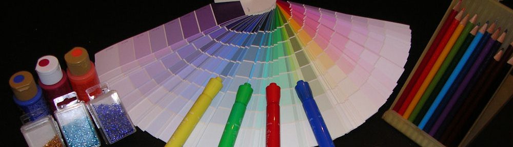

Believe it or not, color influences our behavior, actions and expectations. Businesses use this knowledge to gain customers, build trust and brand recognition, and increase their profitability. Sometimes it is quite obvious, and others are more subliminal. There’s a delicate balance in creating a memorable impression to play upon our emotions or inspire particular thoughts and actions. Let’s look at some examples of how color is being used on a daily basis.

But first, let’s play a game! Can you name each of the companies associated with the four photos above? Your subconscious mind has been trained to recognize brands. Many are instantly known by a particular color combination. Did you guess them all correctly? Read on to find the answers.
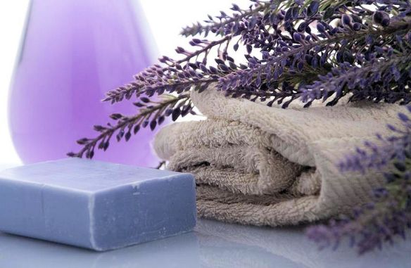
Day spas offer renewal and relaxation by reconnecting with Nature through pampering treatments set in rooms with earth tones, blues, greens and purples to soothe away the stresses of everyday life. The sweet floral scent of lavender is known to promote restful sleep and has an instant calming affect simply by smelling the fragrance.

The laboratory interiors are typically white to give the impression of cleanliness and purity even though we know there are millions of microscopic germs. Antibacterial wipe, anyone?

There was a time when banks were red brick buildings, symbolic of strength, wealth, and confidence to weather any storm. Today bank’s branding colors include red (a power color and a nod to bricks of past), and green (the color of money and abundance.) Regardless of the colors your bank uses, the message is the same: “Your money is safe with us.”
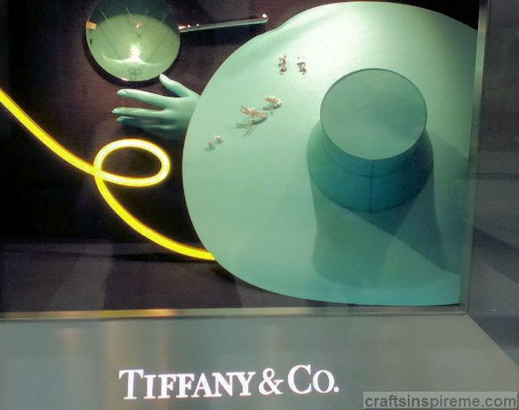
Tiffany & Co. is easily recognizable by its robin’s egg blue packaging, store displays, and interior accents. Many people refer to this color as “Tiffany Blue.” Because it is rather rare in nature, the color suggests bold but delicate designs in timeless jewelry to be treasured for a lifetime.

The jewelry designer, Cartier, often uses leopard print and their signature red packaging in their advertising, but as you can see from the photo, Mother Nature is the originator of this color, pattern and texture combo. It’s wild, exotic, and luxurious.
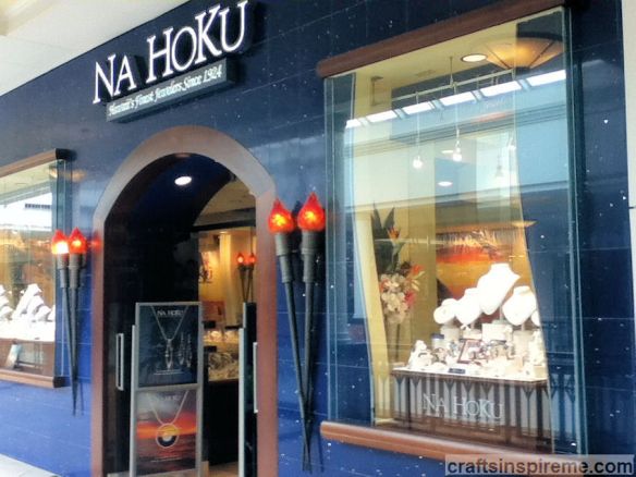
Na Hoku, a Hawaiian jeweler, entices shoppers with a deep blue storefront dotted with shiny silver sparkles, and pairs of lit torches on either side of the entrance, which calls to mind warm tropical evenings under a star-filled sky. Inside, palm tree murals further that beachy vibe, while jewelry designs celebrate the beauty of this paradise found.
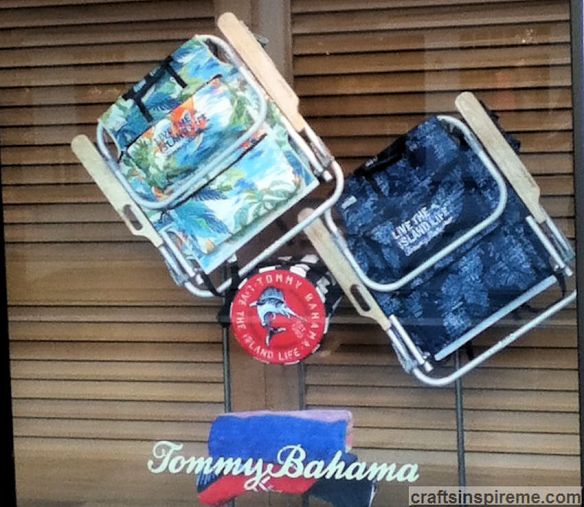
Another name synonymous with the tropics is Tommy Bahama. Their merchandise and stores exude island charm with natural wood plantation shutters, vibrant floral decor, and exotic prints on everything from clothing to umbrellas and beach chairs. Sometimes the stores feature musicians playing guitars or steel drums to foster a playful, party atmosphere inviting everyone to come on in, stay a while, and take a piece if the tropics home with you today.

You would think that limiting yourself to a palette of pastel colors would restrict your options for creating new products and drawing new customers. Lilly Pulitzer has successfully accomplished this and is one of the most easily recognized brands in the world.

The French company, L’Occitane, stands out among a sea of retailers because of its signature golden yellow color on its products, storefront and interior. Competition is fierce so it pays to draw attention with a bold presence. Back it up with fine quality and service, and you will have customers for life.

The warm, rich, layered flavors of coffee are echoed in the earth tones, wood grain and brick textures in this popular coffee shop. This down to earth atmosphere invites you to kick back and stay a while, as you enjoy a few cups of your favorite beverage and maybe a scrumptious, fresh-baked muffin too.

The green walls and brown display case suggest nature. The signage reassures shoppers it’s fresh and organic. The light purple labels and packaging are appealing against the reds, oranges and greens found in fresh produce. The better it looks, the more you’ll want to buy.
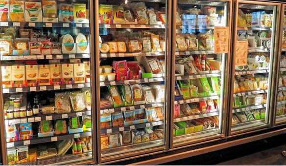
Food packaging depicts professionally prepared and photographed dishes to tempt you. The actual product may look nothing like it, but manufacturers pay consultants hefty fees to select the perfect colors for their products as well as the packaging. Supermarkets invest fortunes in colorful displays to entice shoppers to buy more.
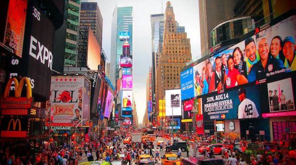
Time Square – Billboards, storefronts, and signage all vie for your attention in a very competitive world. Where will you spend your shopping dollars – probably at the shops with the most inventive storefronts and/or branding? Those advertising campaigns stick with you, and your brain is all too happy to supply you with purchasing options.
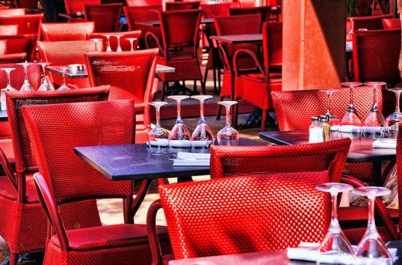
You’re seated at a table in a fine restaurant sipping wine in an elegantly appointed room with red walls. Why? Studies show the color red stimulates the appetite, which results in consuming more food and drinks and more profits for the restaurant. Restaurant ambiance is created by combining many elements – light level, color scheme, lamp type, china color and pattern, linens, upholstery, etc. Nothing is by accident – it’s tailored to make you spend more.

McDonalds enlists the help of the color red to encourage eating more, but it’s combined with yellow so don’t get too comfy. Hard seats and dense table arrangements ensure guests will make this a short stay. The subliminal message: Eat fast and go!

The Cheesecake Factory – What will you do to pass the time while you wait for a table? You’re hungry. You could take a look at the menu, but most customers peruse the Takeout Desserts counter, which is filled with the most tempting cheesecakes and sweets. The rich chocolate browns and caramel colors, in the interior as well as the foods, entice your taste buds. You’re not walking out of here without buying dessert.
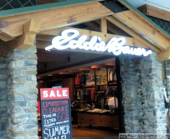
What could be more outdoors than forest green accents, river rocks, and lots of natural wood trim? Eddie Bauer immerses customers in the great outdoors long before their adventures begin.
Take a look at your office, the local supermarket, and the stores you frequent. What kind of atmosphere are the colors and textures creating? How do they make you feel? If you could make one change, what would it be? Hopefully this has given you some food for thought. If you have any ideas to share, please note them in the comments section. Until next time…
Thanks for Reading & Happy Crafting!

well written…colors are very important for attract customer’s for your product…you have to be creative minded for selection of colors….good post….thanks for share
LikeLiked by 1 person
Thanks for reading and commenting. You’re so right about the importance of color. The effects of color are fascinating. Have a great week.
LikeLike
Wow! Amazing post! Very interesting, it’s true, colors create many reactions.
Fascinating exactly! You let me thinking about the color I choose for my blog…
Thank you very much for share awesome information, great blog!
Have a lovely time! Keep well.
Elvira
LikeLiked by 1 person
I’m so glad you liked it. Thank you for reading & commenting. It’s always a pleasure hearing from you! All the best!
LikeLike
Thank you very much for your kindness. Always enjoy your wonderful and creative blog. I love crafting! Appreciate your words.
All the best too!
LikeLiked by 1 person