
Choosing colors is one of the most difficult parts of any project. Fortunately the ultimate artist, Mother Nature, has already done most of the work for us. Below are assorted nature photos to inspire your exploration of the infinite possibilities of color.
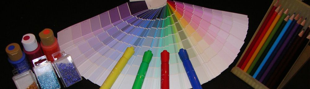
The Color Wheel

A Color Wheel – all the colors of the visible spectrum, that is, visible to the human eye.
Primary Colors

Primary Colors: Red, Blue, & Yellow – base colors found in nature.
Secondary Colors
Secondary Colors: Green, Orange, & Purple – are made by mixing two primary colors together.
Black & White

White & Black – produce shades of color from light to dark. Black and white is a classic combo often used in the textile and interior design industries. Turn the ordinary to extraordinary by adding brilliant jewel tone colors, such as sapphire blue, emerald green or ruby red.
Complementary Colors

Complementary Colors: Opposites on the color wheel (red & green; purple & yellow; blue & orange). When used together, they produce the highest contrasts.
Rainbow

All the colors of the spectrum – Red, Orange, Yellow, Green, Blue & Violet – in that exact order can be seen in this rainbow. If you want to create a realistic rainbow effect, be sure to get the color order correct.
Fresh Picked Fruit

Pastel Red, Green, Fuchsia & Orange – These are great spring and summer colors.
Tropical Fish

Golden & Reddish Browns with White, set against a Green background – Brown & White are another classic combo, which look great with jewel tones.
Hibiscus Bloom

Red, Orange, Yellow & touches of Pink & White – Warm pastels with a dramatic red center attract attention.
Molten Lava

Black, Orange, & Yellow – These colors remind me of my favorite holiday, Halloween.
Floating Lotus Blossom

Pure White & Yellow offset by Green, Blue & Black – White is such a cool, crisp color in summer, and coordinates with any colors in warm or cool tones.
Field of Tulips

Orange, Green, & Yellow contrast with Blue – Pastels come alive with a punch of color.
Peacock Feathers

Blue, Green, Gold, & Black – Exotic & luxurious is the vibe created by these colors. The electric blue set against the black makes a bold statement with the naturally shimmering gold and green.
Cherry Blossoms

Pink & Blue – In the case of these cherry blossoms, bold colors would be overpowering. Such tiny, delicate blooms call for gentle, soft colors. Is it any wonder these colors are often used for baby nurseries?
Pansies

Purple, White & Yellow – The frilled purple petals resemble watercolors, while the yellow centers look like they were hand painted in this striking palette.
Rainbow Lorakeets

It’s hard to believe that one animal could have all the colors of the rainbow, except purple, and yet here it is in two small parrots. If Mother Nature can come with this, imagine what you can do.
Spiral Stained Glass Windows

Blue & Red with Green, Orange, Purple & Yellow accents – The spiral draws your eye toward the center, while the blended colors move you along one frame at a time.
Sunset #1

Purple, Yellow, & Blue – Cool colors of evening (blues & purples) provide the dramatic backdrop for the vibrant yellow sun setting at the distant horizon. This palette has a dreamy, relaxing quality.
Sunset #2

Red, Yellow, & Orange with touches of Pink & Purple – Blended warm colors have an energetic, motivational effect.
The next time you are looking for some color inspiration for your next project, take a look outside. Mother Nature has provided a feast for the eyes. Don’t be afraid to experiment. You’ll be pleasantly surprised. To learn more about color, please read “World of Color – Part 1” and “World of Color- Part 2.”
Happy Crafting!
